Custom Wedding Stationery: Behind the Scenes of a Save the Date Suite
- Mar 2
- 4 min read
Save the Date Suite | Custom Crest | Venue Paintings| Handwriting
I was delighted to work with C&J, two New York City creatives planning a summer wedding in coastal Connecticut. Ten months before the wedding, they reached out to create a Save the Date suite for their celebration, featuring a custom crest and watercolor illustrations of their venue.
They were looking for custom wedding stationery that balanced the warmth of sharing happy news with the spirit of the formal wedding they were planning—something that felt personal, thoughtful, and welcoming.


Collaboration Call
We began with a collaboration video call to align on color ideas, overall look and feel, and budget. The bride mentioned wanting their Save the Date to feel like a letter from a friend, and I immediately knew that the details they shared about their hometowns, how they met, and their move to New York City together would help inform the design.
These early conversations lay the foundation for all the decisions and work that follows.
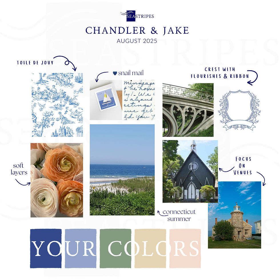
Mood Board
A mood board helped synthesize everything we discussed and offered initial design direction. For C&J, I pulled inspiration from their favorite New York City spot—Central Park—suggested including a handwritten note, and proposed incorporating flowers from their home states into the crest.
It’s always exciting to see elements of a couple’s life begin blending on the page.
Sketches
Once they officially became clients, the next step was sketching the Save the Date suite. These sketches outlined the elements included and the overall structure of the design.
They loved the full-bleed watercolor artwork of the lighthouse and we discussed adding paintings of both of their venues to the back of the card.
At this stage, we also confirmed finishing details: navy envelopes with white addressing, a celebration blooms stamp, a tiny gold heart paper clip, and vellum sheets to protect the artwork during mailing and add a soft layer for a dramatic reveal.

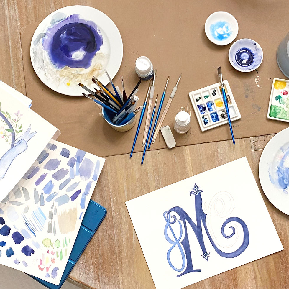
Painting
Over the following weeks, I worked on bringing C&J's vision to life through watercolor. I shared behind-the-scenes photos and occasionally checked in about specific details—like the color of the dogwood tree at Chandler’s parents’ house (pink).
Personal Details
The pink dogwood flowers made their way into the design, along with other meaningful details. Flourishes inspired by the ironwork of a Central Park bridge were incorporated, and their home states were represented through flowers—details that felt personal without being overt. Their custom crest includes subtle personal elements alongside florals and ribbon motifs that could be used throughout their event branding.
Read more about how their custom crest became a visual signature and a key part of their wedding weekend through event branding & signage.

Venue Paintings
Next came the venue paintings, one of my favorite parts of the process. I love thinking about the meaning these spaces hold—or will hold—for a couple, and how these small works of art will become heirlooms for them and their families for years to come. The Lighthouse Museum in Historic Stonington, CT, and Pequot Chapel in New London, CT, are stunning buildings with quirky details that beautifully translated to watercolor.

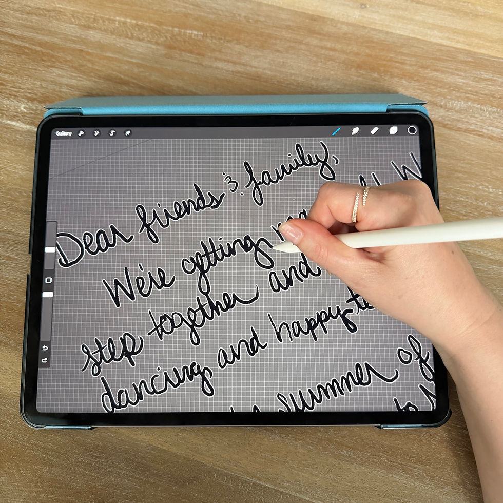
Handwritten Note
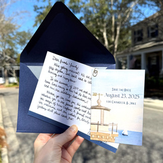
From the beginning, we knew the handwritten note needed to be a central part of the suite. The bride shared a note announcing their engagement, asking guests to save the date, and offering additional destination details.
I traced her lettering so we could refine spacing and make edits while preserving her handwriting. The warmth, originality, and personality it brought to the suite felt unmistakably like her.
Refining Details
The couple reviewed all of the artwork, and we discussed any final adjustments. After seeing initial designs, the bride called to request new monogram options that felt more formal and better represented their formation as a new family.
I redesigned the monogram to intertwine their letters and incorporate more of the Central Park ironwork details they loved. Collaborating at this level—until every detail feels right—is one of the most rewarding parts of the work. This monogram will appear throughout their wedding and beyond, becoming part of their shared life together.
Final Mock-Up & Printing
Once all designs were finalized and formatted, a final mock-up was shared for last looks and print approval. The suite was printed with careful attention to paper stock and texture. The note cards were premium triple-thick with a smooth matte finish, while the details card featured a richly textured felt paper to showcase the watercolor artwork—while still working within USPS single-stamp weight limits.

Fulfillment Process
As part of the Seastripes Process, C&J sent over their guest list, and I handled all assembly and addressing details with care. I flagged discrepancies, accommodated last-minute additions, and ensured everything was prepared for a smooth mailing.
At the Mailbox
There’s nothing quite like the week Save the Dates go out. As guests began receiving theirs, messages started coming in:
“This is the most beautiful Save the Date I’ve ever seen in my whole life.”
“So unique and meaningful and heartfelt!!!”
“Classy, informative, fun, and full of your personalities.”
“GORGEOUS! You nailed it.”
"Can we RSVP now?"
If you’ve worked with me before, you already know this: your event begins at the mailbox!